abhilashbera.dev › work › component-design-system
Component Library & Design System
Frontend · Tooling · DX
A design system that started as a folder of copied components and became the fastest way to ship a consistent interface.
- Year
- 2024
- Role
- Frontend · Tooling
- Status
- Maintained
- Stack
- React · TypeScript
Problem
Four products, four button implementations, four interpretations of the same spacing scale. Every new screen re-litigated decisions that had already been made, and accessibility fixes landed in one product and nowhere else.
Solution
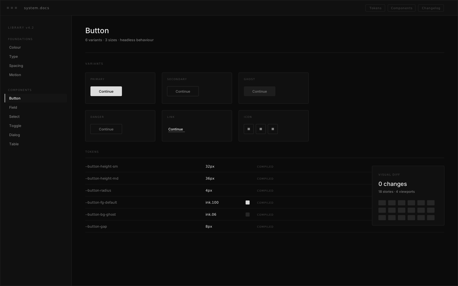
Design tokens are defined once and compiled to CSS variables and type definitions, so a value cannot drift between design and code. Components are built headless-first with behaviour separated from presentation, documented in Storybook with the accessibility criteria they satisfy, and released on a versioned pipeline with visual regression tests.
Features
- 01
Token pipeline
One source compiled to CSS variables, TypeScript types and documentation.
- 02
Headless primitives
Behaviour and accessibility separated from presentation for per-product theming.
- 03
Visual regression
Every pull request diffs rendered components before release.
- 04
Versioned releases
Semantic versioning with codemods for breaking changes.
Technology
Library
- React
- TypeScript
- Tailwind CSS
- CVA
Documentation
- Storybook
- MDX
Quality
- Vitest
- Playwright
- axe
Release
- Changesets
- GitHub Actions
- npm
Architecture
01Source
Design Tokens
Single definition
Primitives
Headless behaviour
02Build
Token Compiler
CSS vars · Types
Bundler
ESM · Types · Tree-shake
03Quality
Visual Diff
Per pull request
a11y Suite
Automated audits
04Consumers
Product Apps
Four teams
Storybook
Living documentation
Request flow — left to right
Result
New screens are assembled rather than rebuilt, and an accessibility fix now ships to every product in one release instead of four separate tickets.
- Products on one system
- 4
- Documented components
- 60+
- To fix all products
- 1 release